Thryll
Sexual Wellness
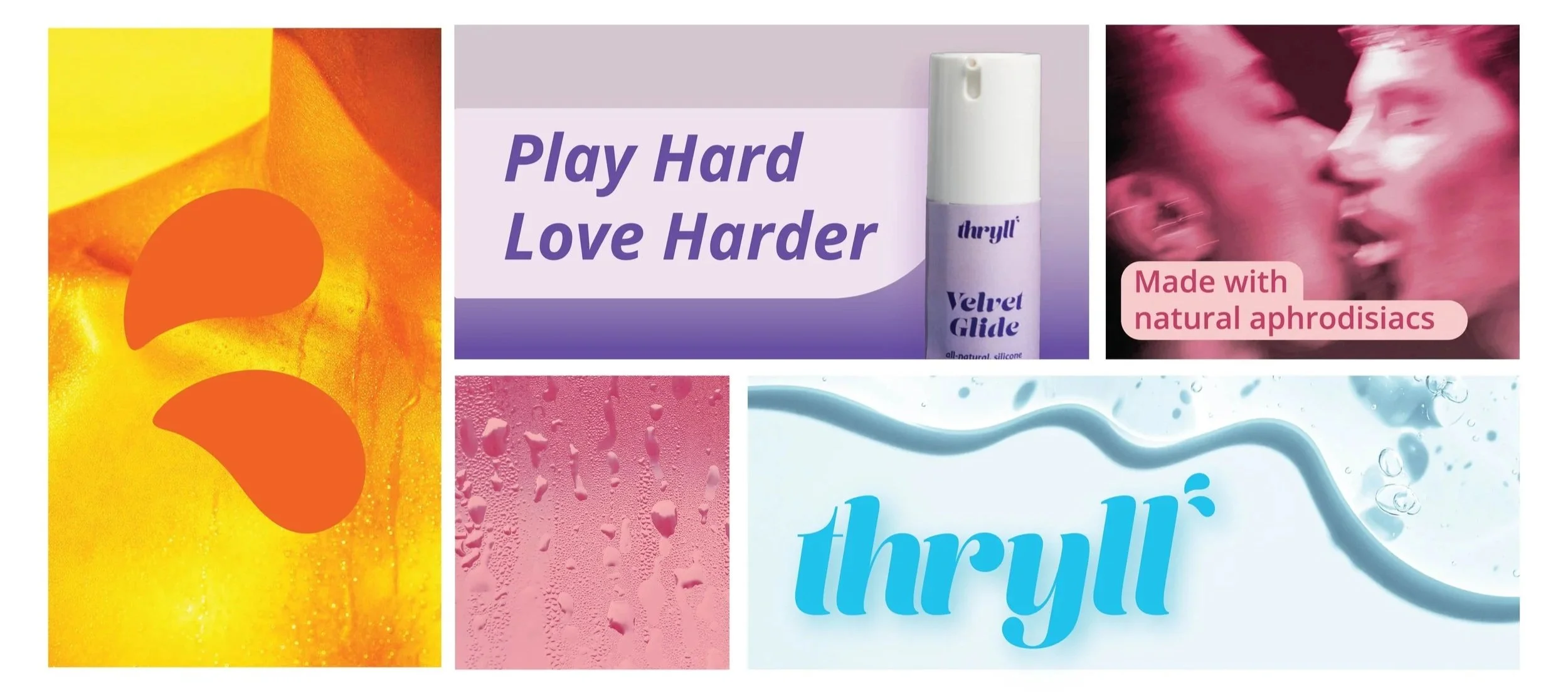
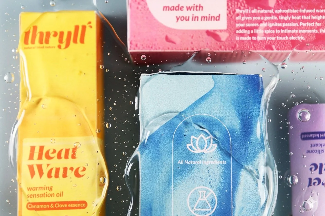
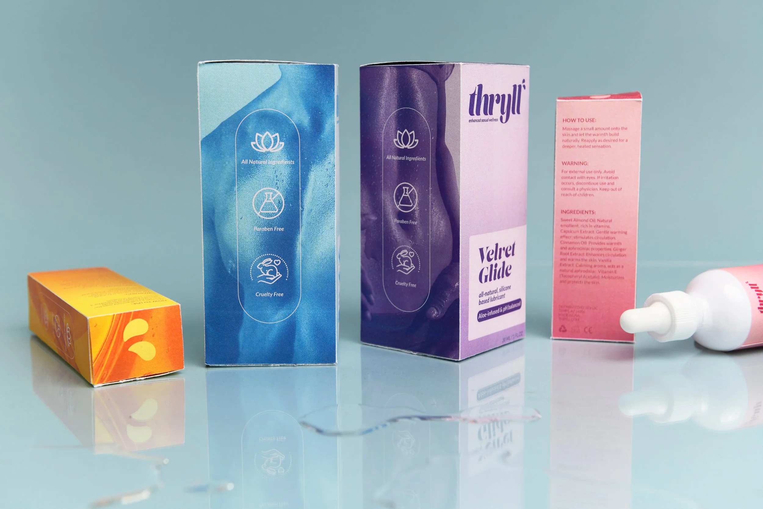
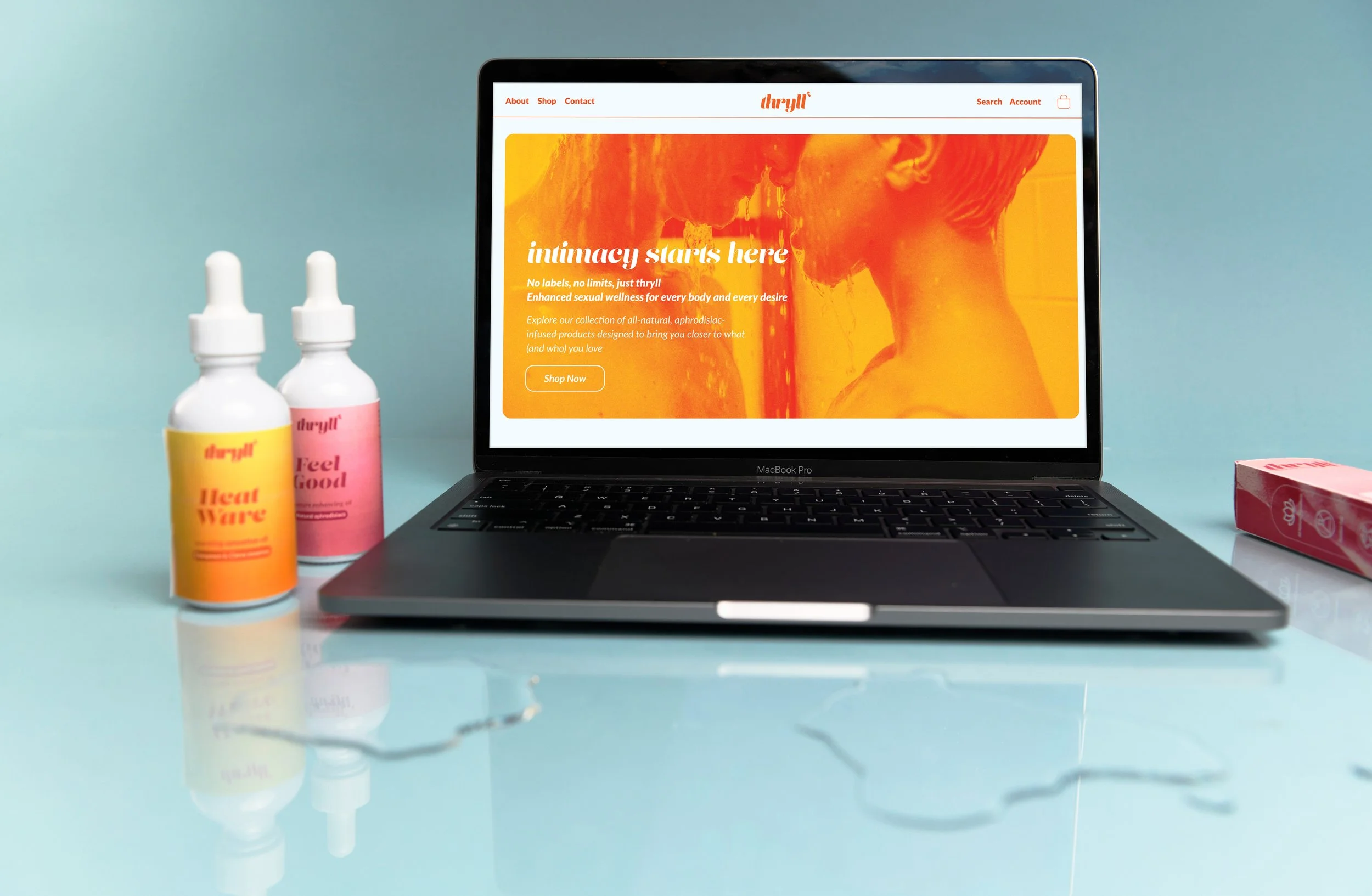
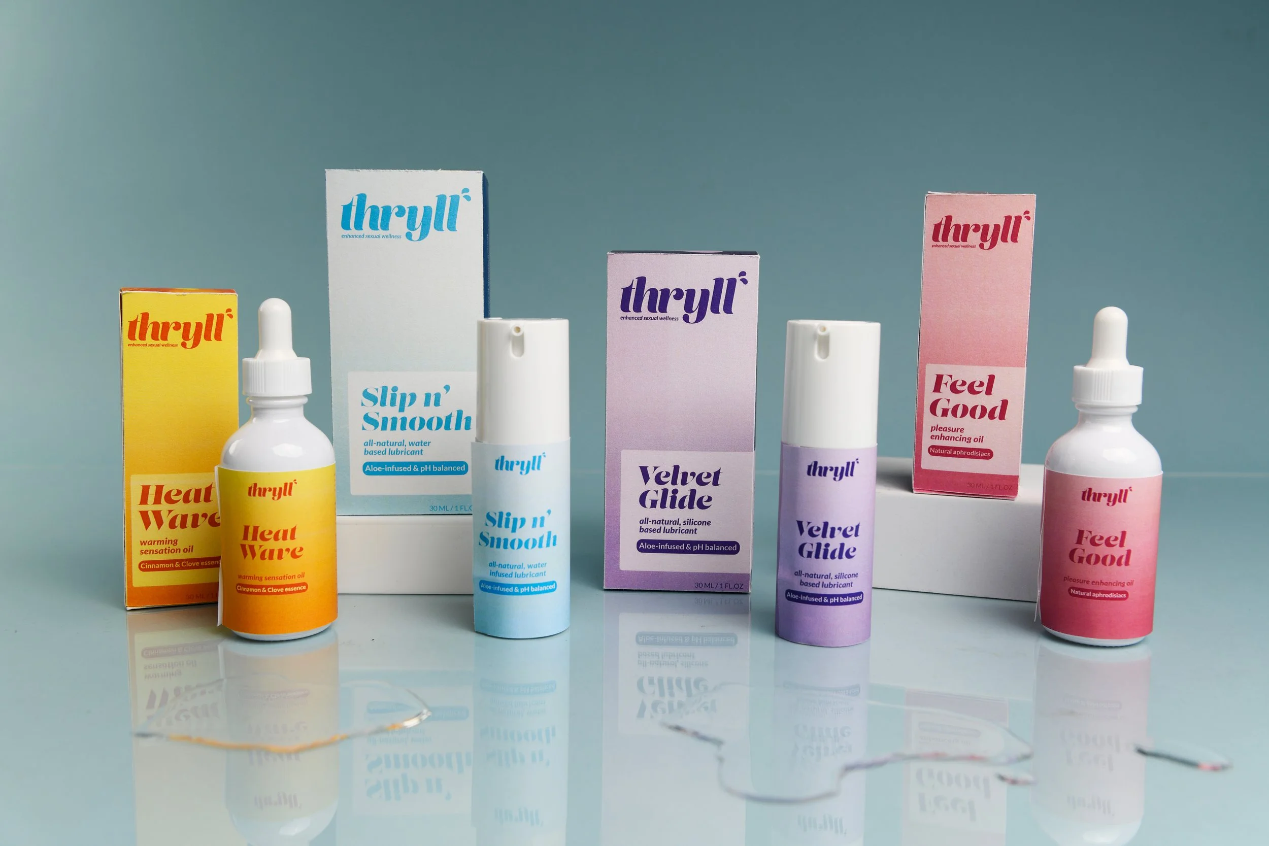
Thryll is a bold, inclusive sexual wellness brand. Confident typography, vibrant color, and clear communication around natural ingredients create an identity that feels direct and energetic. Where most products in this category are clinical or narrowly targeted, Thryll is built to feel empowering and accessible to a wide audience.
Scope of Work
✦ Brand Identity
✦ Art Direction
✦ Packaging Design
✦ Creative Strategy
✦ Conceptualization
✦ Naming & Logo
-
Sexual wellness products are too often clinical, discreet, or narrowly targeted. The result is a market that feels exclusive rather than welcoming.
-
Consumers want products that inspire confidence while still feeling safe and accessible. Inclusivity, natural ingredients, and a vibrant identity can work together to make sexual wellness approachable for a wide audience.
-
Thryll pairs confident typography with bold color and dynamic graphic elements. Clear communication around natural ingredients keep the identity grounded, resulting in packaging that feels empowering rather than clinical.
Brand Identity
Thryll is built around sensory experience without being explicit about it. Zoomed-in body shots and fluid, liquid patterns create imagery that feels intimate and personal while staying open to interpretation.
The duotone color treatment adds energy and keeps the visual language bold rather than delicate. It signals confidence, not clinical wellness.
The overall effect is a brand that communicates touch, pleasure, and connection through suggestion. Curious and inviting rather than prescriptive.