Joule
Fruit Energy Snacks
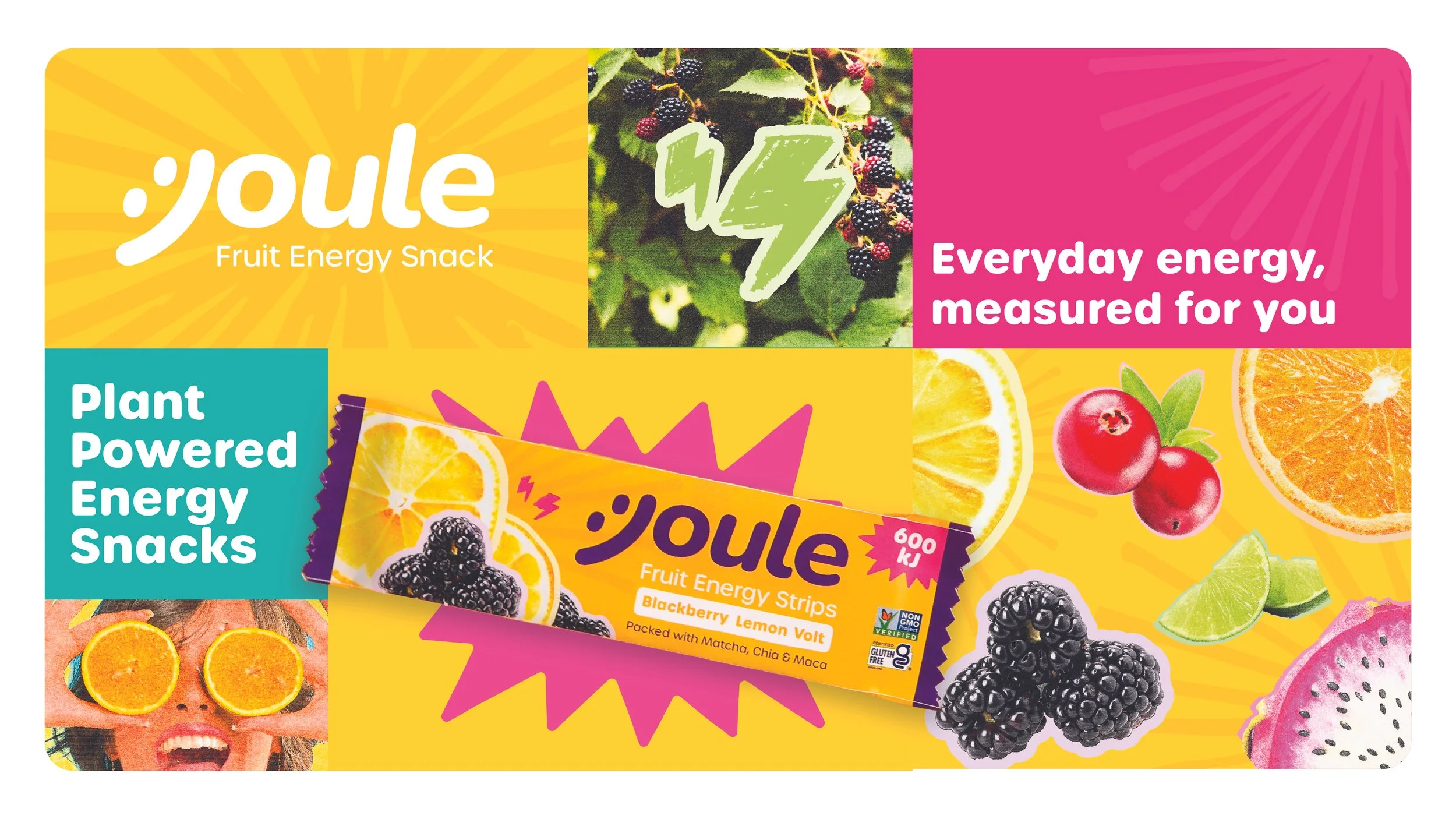
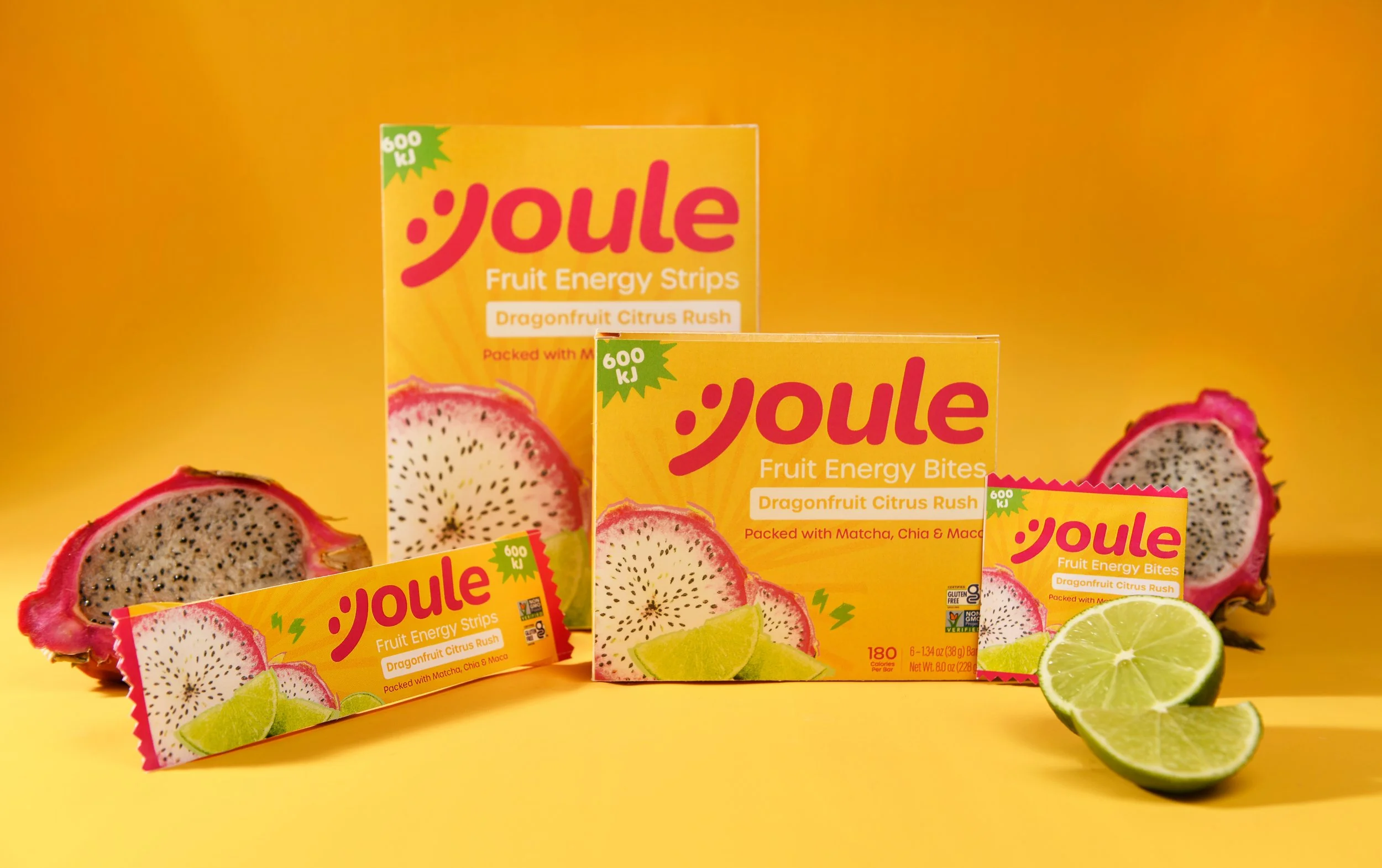
Joule is an energy snack brand built for everyday routines. Warm and playful packaging present natural ingredients as part of a normal daily routine. Where most energy products speak exclusively to athletic performance, Joule positions steady, reliable energy as something that fits a workday or a commute.
Scope of Work
✦ Brand Identity
✦ Art Direction
✦ Packaging Design
✦ Creative Strategy
✦ Conceptualization
✦ Naming & Logo
-
Every energy product on the market speaks to athletes or extreme performance. Everyday consumers have no option that feels relevant to ordinary routines like commuting or working.
-
People need steady, reliable energy. Not intensity. Framing energy as measured and reliable rather than extreme opens the product to a wider audience and aligns it with real daily habits.
-
Joule was built around energy, clarity, and packaging that presents natural ingredients as part of a normal routine. Functional nutrition that feels familiar and easy to trust.
Brand Identity
Joule is built around the idea that energy should feel normal, not extreme. The identity is warm, playful, and direct, speaking to people in the middle of an ordinary day rather than at the start of a workout. The voice never takes itself too seriously but stays clear and confident about what the product does.
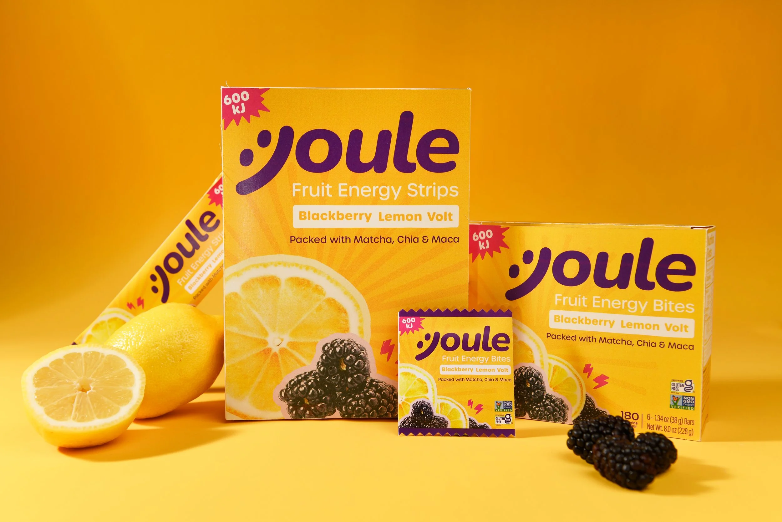
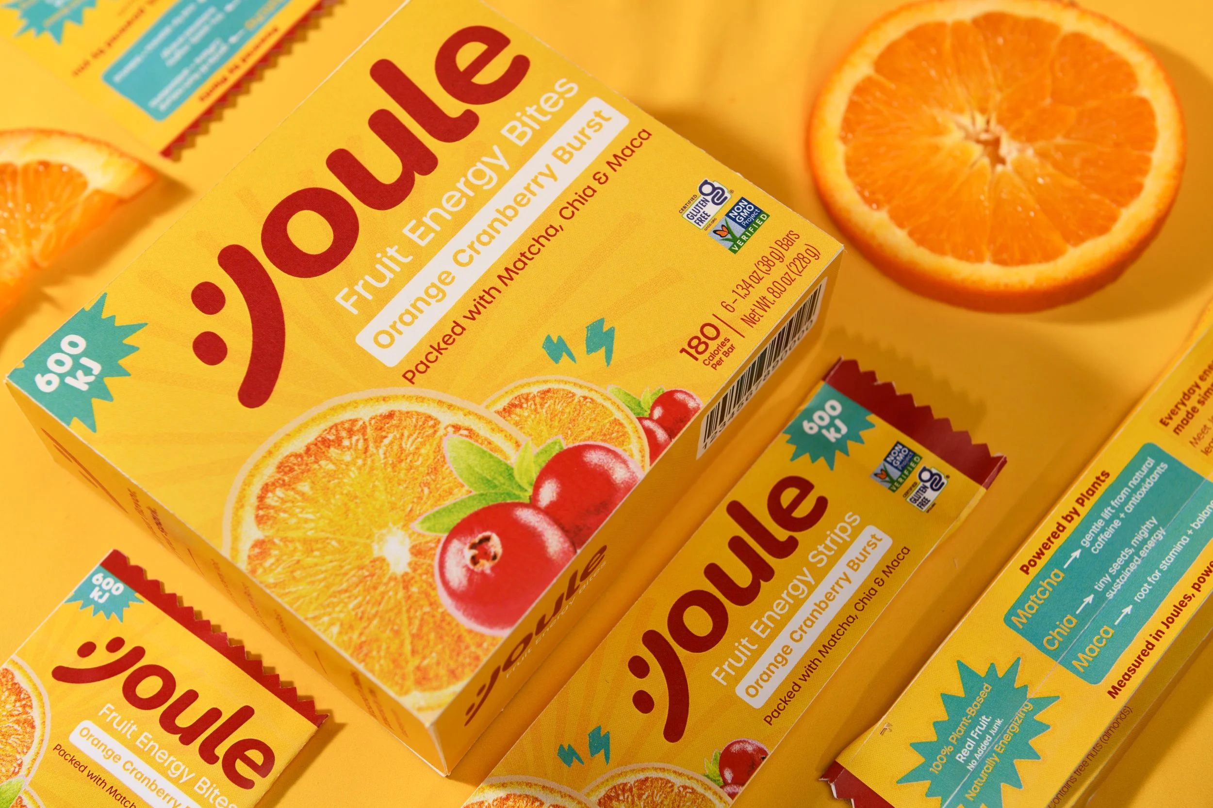
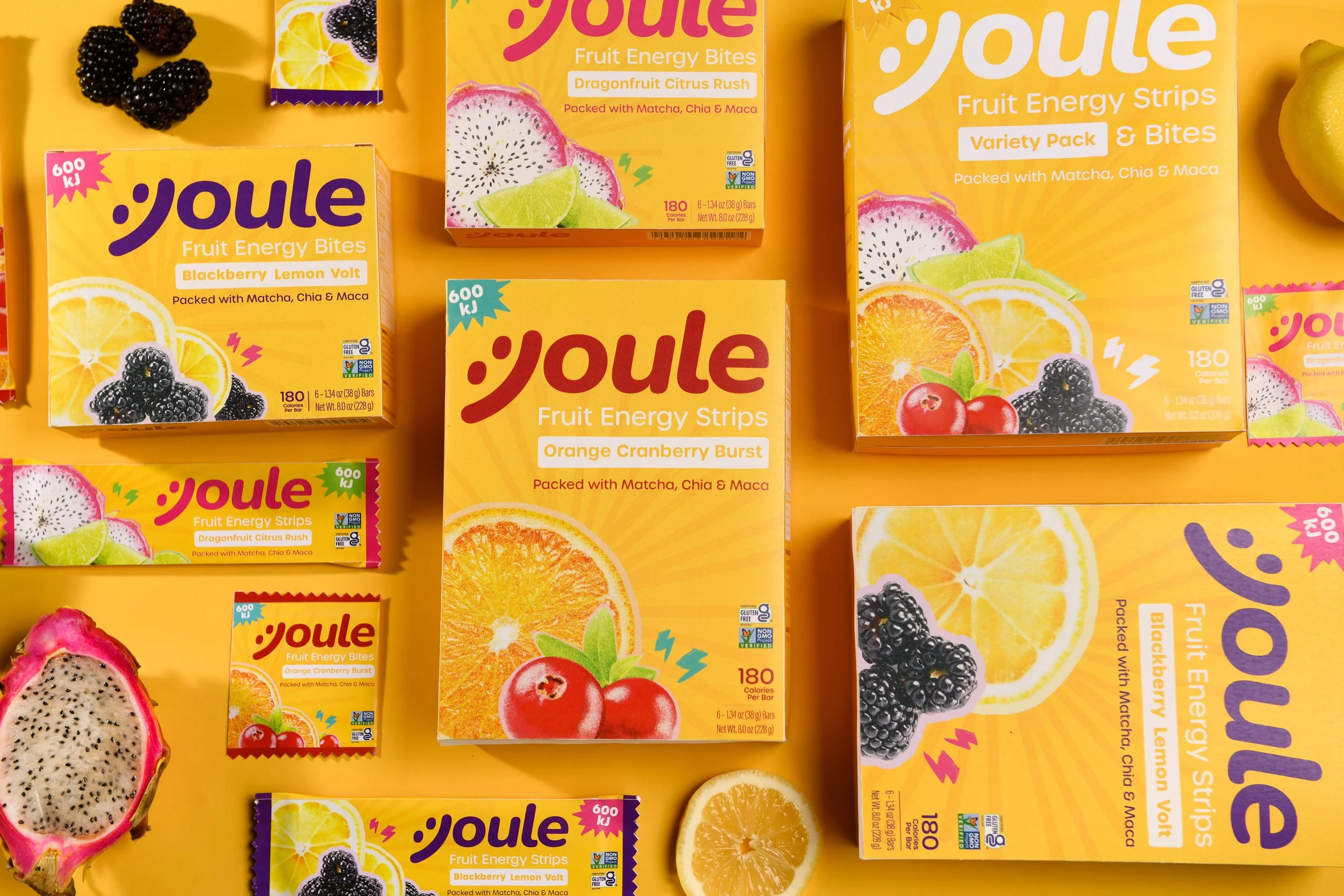
The packaging is energetic without being loud, using friendly visuals and a considered palette to make natural ingredients feel approachable and familiar rather than clinical or performance-driven.
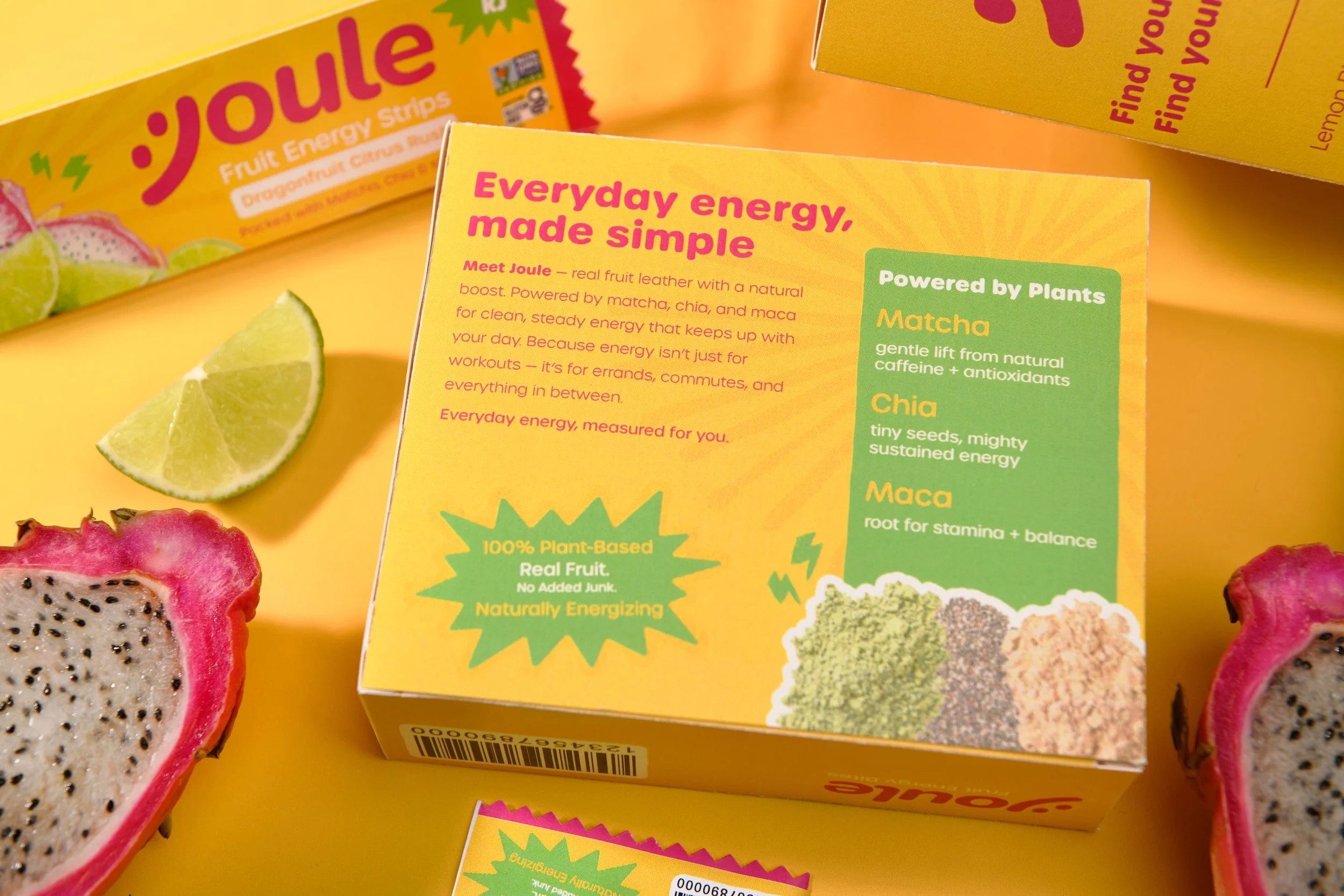
The overall system is consistent and easy to trust. Every touchpoint reinforces the same idea: steady energy that fits into real life, no intensity required.